Everyone has a feedback form on their website, but not a lot of them put enough thought behind one. Most of the feedback forms that I see on websites and Facebook pages tend to have very similar characteristics. Enter your name, e-mail address, message and also solve this CAPTCHA created by Satan himself.
So how do you create the perfect feedback form? Or at least a really good one.
It’s an important factor of your website to pay attention to, given that this is where you’ll be generating sales leads, answering questions, getting feedback, growing your network, getting requests, it’s essentially the contact portal in many ways between you and your customers.
For the purpose of illustration, I’m going to use Circus Social’s feedback form that’s on their Facebook page and website. It was created using this tool.
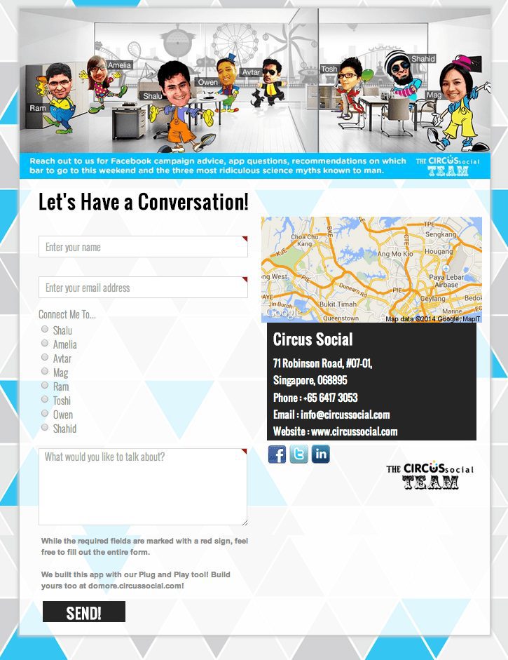
The feedback form we’ll be examining today!
When I think about a perfect feedback form, there are four elements that I always like to pay attention to.
- The header – The captivating visual at the top.
- The form fields – What visitors are going to be filling out.
- Messaging – Before your customers connect with you, are you connecting them as well?
- Misc. – A collection of elements on your feedback form that complete the experience of connectivity.
None of these are more important than the other – I feel each of them should be given an equal amount of weightage. If either of these are lacking in quality, it won\’t make your customer not reach out to you perhaps, but it will make a dent in their experience, their expectations and their overall opinion of you and your brand.
So how do you sharpen these areas?
The Header
Here’s where the magic happens. Your header should ideally be a place where you’ve got a really catchy image, something that reflects your brand\’s persona. If you’re an insurance company, please don’t use a stock photo of a man shaking someone else’s hand. You can do better. What’s your brand about? What sets you apart? What do you do better than other insurance companies?
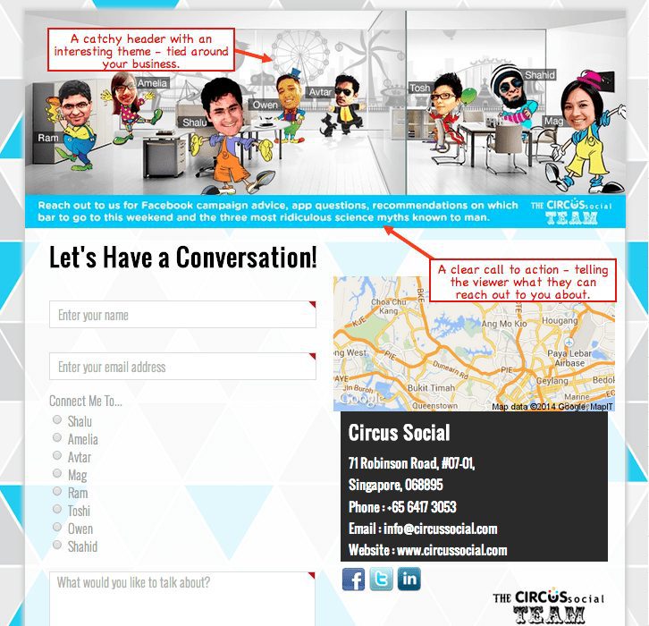
The header needs to be catchy and capture the attention of your audience.
For Circus Social – the pitch of the brand has always been that like the troupe of a circus, each person brings something unique to the table that helps their clients. The banner has everyone in the team, having a good time and being jovial. It makes someone reaching out understand what the tone of the company is most likely to be.
And beneath that – a catchy little one liner that tells visitors what they should reach out to you for. Should they get in touch for technical questions? Questions about new hires? Anything at all? It’s important that make it very clear what this particular form is for, especially if you have a number of forms that are handled by different people.
The Form Fields
The general rule for this is always to keep it simple. You don\’t want a long drawn out series of questions and entries here that ask your visitors about their date of birth, where they last had lunch and what their preferred choice of pasta sauce is. It\’s irrelevant. Ask only what truly matters in the very first interaction.
Hi, what\s your name and how I can help?
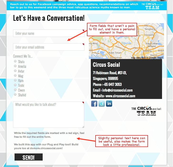
The form fields. Simpler the better.
In this particular instance, for Circus Social, there’s a slightly personal connection formed. You can choose to be connected to a particular person if you’d like. If you already know someone from the team, perfect. If you’re reaching out because you saw something someone in the team mentioned – great! If you’re looking to reach out to no one in particular, just pick someone who looks friendliest in the banner. 😉
It\’s little things like this that make feedback forms a little bit of fun, add a slight personal touch, and excite the visitor – and eventually, add up to making it a perfect feedback form.
Misc. Elements and Messaging
So you have the banner and you have your form fields. That covers the basic elements of your feedback form, and that’s where most people usually stop. But there’s always that question, What else?
And it’s hard to find where to stop. The two very basic things that you should definitely have in your feedback forms after you’re done with your form fields and banner image:
- Alternate ways your visitors can contact you.
- Links to your social profiles.
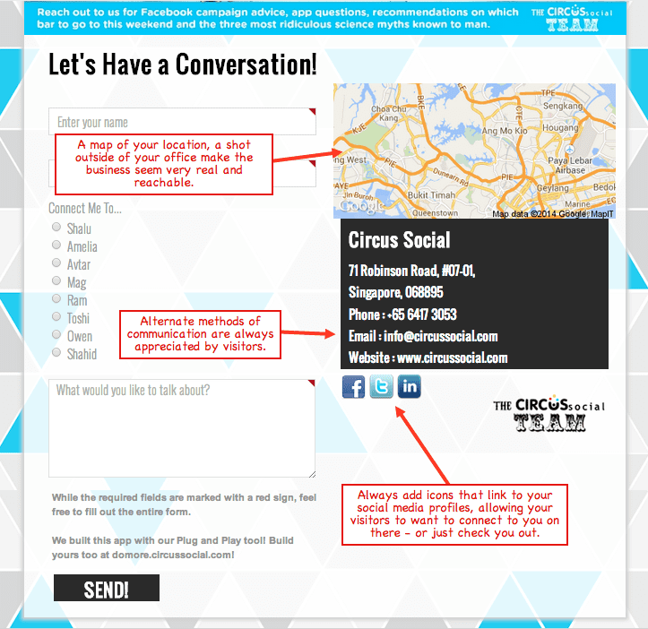
The other smaller elements add a lot of character to the page.
As in the example above, it’s also useful to add either a map that locates where your business is located or perhaps just a picture of where the business is. It adds that little natural element that makes the business appear a lot more real. Now of course, huge companies like Apple, Microsoft need not do this – but for smaller brands, entrepreneurs, cafes and the rest – it’s not something that you can skip out on.
And finally of course – who does the message go to? Hopefully not the CEO. All messages from the feedback form should go to someone in your communications department, or someone in charge of client relations/sales if your team isn’t quite big enough to have its own marketing department. If you’re an entrepreneur, you\’ll be very tempted to have all the messages come to you. Be very cautious, if you feel you’ll have the time and bandwidth to reply to these messages – go for it.
If you’re looking to set up a perfect feedback form – here’s the tool that you should use to create one!
Book your Radarr demo today!

