Of late Facebook has been on an overhauling spree, from its News Feed algorithm to the significant change in their embedded posts display; the changes just don’t seem to cease! To add to the confusion, which seems to be Zuckerberg’s forte, Facebook is rolling out some new “like” and “share” buttons.
Facebook encourages people to make their posts public and share newsworthy content, and hence, optimizing this feature was very important – considering the new Facebook News Feed algorithm prefers to display more relevant and timely content.
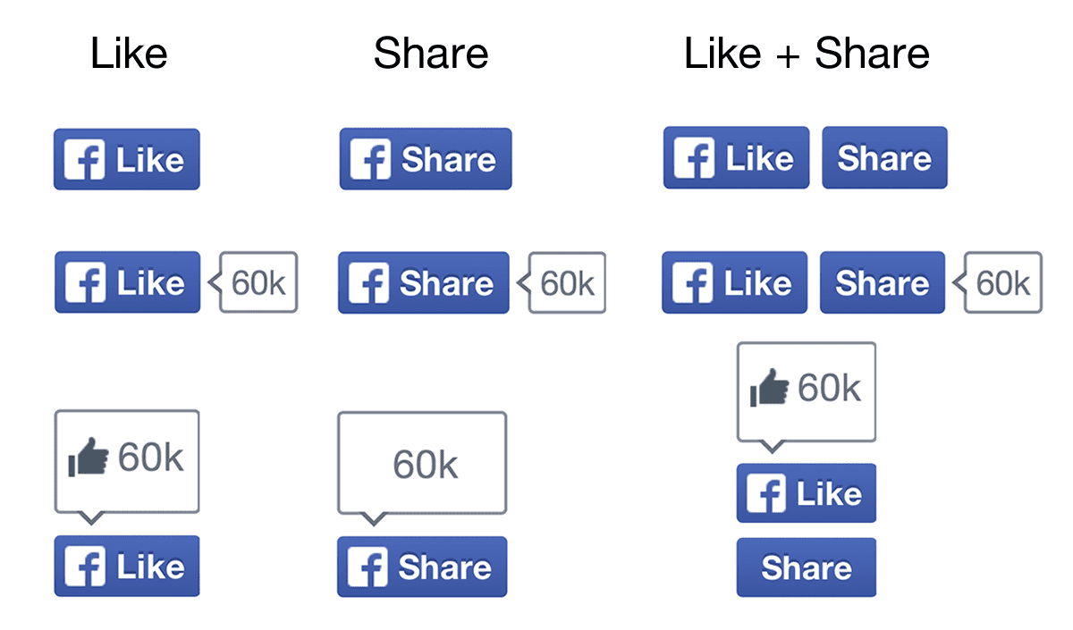
The redesigned Like and Share Buttons for Facebook.
The social network announced the redesign of its “like” and “share” buttons, on their developer blog, stating: “In early tests over the past month after launching the new like and share buttons, we’ve seen more than a 5 percent lift in likes and shares across the Web. This is significant, given that both buttons are viewed more than 22 billion times daily. Based on these results, we’ve rolled out the new design to everyone and extended it to the follow and like box plugins, as well.”
The stories that are generated when a customer clicks on the like and share buttons are automatically shared with their friends and family, resulting in high referral traffic; making Facebook the “single biggest” source of traffic on the internet.
So, what’s new and special about these buttons? The new buttons can be embedded on websites, easing the process of displaying the like and share buttons side-by-side or only the share or like button; encouraging user interaction and resulting in an increased number of “likes” and “shares” – something that brands seem to absolutely love.
Even though the eyes see no significant change in these buttons, their impact reportedly has been formidable – from November 2012, the time these buttons were redesigned and put under trial, the buttons combined have been viewed more than 22 billion times in a day, increasing the number of likes and shares by a whopping 5%; compared to the statistics of the previous buttons.
But is the mere redesign of these buttons behind this “Big Bang”? It would definitely seem so – although it would also mean that people are simply clicking the buttons because they seem new and flashy. Could it be more engaging content on Facebook pages, resulting in more likes and shares? Unlikely – given that community managers worldwide probably didn’t become content marketing geniuses at the exact same moment the new Facebook buttons were released.
Or, people are just clicking on these buttons out of curiosity. (Hmm..that’s new! What does it do?) This seems to be the most plausible right now. Don’t shoot us.
Haven’t seen or used the new buttons yet? As is the case with every Facebook change, these are gradually being released across accounts. I saw them for the first time a few days ago, while a non-social media savvy friend saw them a week ago, driving me up the wall.
Considering that the results are A-1, we’ll be seeing the updated buttons very soon. (Maybe, a year-end surprise!) The continuous overhauling screams out the company’s intention to grow as a platform for public sharing. If only they’d sort out their newsfeed fiasco and make community managers happy too.
Book your Radarr demo today!
