User experience design enhances customer satisfaction and loyalty by making your campaign website or social site easier and more enjoyable to use. This design allows you to gauge how consumers will react to your social and digital marketing campaigns once they are live, followed by an analysis of their behaviors.
These are main aspects of UX:
Visual Design
Visual design represents the aesthetics or look-and-feel of the front end of any user interface. Put simply; how your website looks.
The purpose of visual design is to use visual elements like colours, images, and symbols to convey a message to its audience. The design must enhance the user’s experience of your website. Bold colours must highlight priorities like call to action buttons rather than adding background images that hinder the user\’s experience.
Information Architecture
The IA is the model that structures the information of your website or social site. The IA makes the campaign content easily navigable so that users can find the most useful content for them.
Structuring, Organizing and Labelling
Structuring is reducing information to its basic building units and then relating them to each other. Organisation involve grouping these units in a distinctive and meaningful manner.
Human-Computer Interaction
Human-Computer Interaction is the main contributor to user experience design because of its emphasis on human performance rather than mere usability. User experience cannot be manufactured or designed; it has to be incorporated in the design. Understanding the user\’s emotional quotient plays a key role while designing User Experience.
Cancer Research UK and User Testing
At Cancer Research UK, we gather HCI information from User testing sessions. User testing aims to test aspects of your site that are new or need improving.
We run user testing sessions once a week to test the website with volunteers who match the correct personas. For instance, we would test a sports event campaign with volunteers and supporters with an interest in sport. A cancer information page would be tested with patients or medical professionals.
Our user testing takes place in a user testing lab. The user sits in one room with a computer or device linked up and mirrored by a computer on the other side. There is also a double sided mirror whereby the UX team can watch the user reaction to the website and how they complete the tasks which are asked of them. You may think that this sounds like a CSI investigation but it is an excellent way to gauge HCI.
Stand Up To Cancer
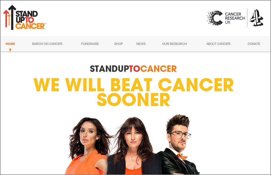
Last week Cancer Research UK launched Stand Up To Cancer, an excellent campaign which sees the charity collaborating with the UK’s television Channel 4. The campaign, which started in America, encourages celebrities and the world to ‘stand up’ and show their support for Cancer Research UK.
I was involved in the initial UX ideation for the campaign. It was important to see the campaign with a fresh perception, abandoning the previous non-responsive site. We wanted a way to display the campaign content in a clean design, as well as incorporating the cool, fun sub-brand that Stand Up To Cancer is.
At each stage in the design and each agile sprint, we would take the site to user testing to ensure that aspects we saw as a priority were clearly defined as most important to the customer. For instance, the key goals for us were to fundraise for the campaign and to sign up to the March on Cancer; the main collective activity. Once the user could easily and happily complete these objectives, we knew the design was looking good.
Typically the outputs from our user testing sessions are:
- Site Audit (usability study of existing assets)
- Flows and Navigation Maps
- User Stories or Scenarios
- Defined User Segmentations and Personas
- Site Maps and Content Inventory
- Wireframes (screen blueprints or storyboards)
- Prototypes (Interactive blueprints)
- Written specifications (describing the behaviour or design)
- Graphic mockups (Precise visual of the expected end result)
Implementing UX For Your Brand
a) Advertise on your social networks for user testing volunteers
b) Hire a UX lab (if you can). If you can’t, simple guerrilla testing and watching whether a user complete a task can be equally as effective.
c) Create a report of your findings E.g. “The user was unable to sign up for an event because they couldn’t find the relevant page and therefore couldn’t fill in the relevant sign up form.”
d) Make informed UX decisions based on how many users found your design or content difficult to understand. E.g. “Most users were unaware that the label say something\’ means share with your social networks. Action: change to social media icons and the wording Share on social’.
Overall, UX may seem like a laborious process but it is necessary. It means that in the long term you will save money on your campaign design because you\’re appealing to the right user personas and that your website design and content compliment your company and what you’re trying to promote.
Benefits of UX:
- Avoiding unnecessary features and campaign spend
- Simplifying design documentation
- Improving the usability of the campaign
- Incorporating business and marketing goals while protecting the customerr’s freedom of choice
Introduce UX into your business. Align your social site with learnings from your website (as much as you can) for the same look and feel on all your platforms. By investing in UX, your campaigns will be more customer driven and in turn more successful.
Complete guide to Instagram social listening, Tik Tok social listening and Twitter social listening.
Book your Radarr demo today!


