After talks of canning the hashtags, @-replies and music app, Twitter has announced the roll out of a few new features for its users. These features include the ability to select up to four photos at a time to upload while composing a tweet and its display as a collage on the tweet’s detail screen. Danny Sullivan does a test run for all his followers in his tweet.
This is a little test using some @AgentsofSHIELD pictures of the new Twiiter collage feature Danny Sullivan (@dannysullivan) March 26, 2014
And if the multi-photo support wasn’t surprising enough, Twitter now allows you to tag other people in your photos. While composing a tweet, a “who’s in these photos?” allows you to add the username of the people in the photo without taking up any characters in the body of the tweet; leaving the full character count for composing the tweet message. And this significantly expands the reach of the tweets.
Similar Features To Instagram And Facebook
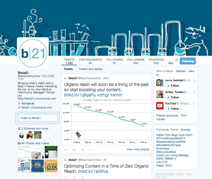
With iPhone and Android device users to be the first ones to get introduced to these features, it seems that Twitter now does believe that mobiles are the ‘platforms of the future’. Twitter experts report that the company is striving to make the platform more engaging and social with its new additions that have already spurred social media users to compare it with its longtime rival, Facebook and its new competitor, Instagram. Layout wise, we think it\’s way too similar to Facebook with its’ cover photo and feed in the center.

Instagram recently hit 200 million followers and is estimated to have more mobile users than Twitter in the US, which automatically explains Twitter’s move to have introduced the image features with an update on its app. So, is Twitter trying to create a mash up of Instagram and Facebook? Well, that is something that is still debatable.
Why Did You Make These Changes Twitter?
Even though Twitter fans are all charged up about its new features, there are a few changes that haven’t gone down too well with them. The company has revamped its ‘ReTweet’ button and changed it to ‘share’. The button offers the same functionality, but takes away the charm of tweeting.
‘ReTweeting’ is now considered as much a verb as ‘Googling’ and Twitter having coined the term that went in sync with their brand image, is now not just facing the negative remarks from its users but also losing out on its branding. With even Facebook getting an ugly overhaul, people don’t seem too pleased with the biggest social media platforms. Platforms as big as them are expected to maintain their brand reputation and not follow the herd.
Twitter is known to have listened to its community when they restored their block feature, but are the new changes going to be accepted or will the platform return to its good old un-Facebook/ Instagram ways? The masses have spoken and clearly put forward their dislike towards the new ‘Share’ button.
#ItTotallyPissesMeOff when I read the news that Twitter Retweet button was suppose to get replaced with Share button. #wtf
— Bhavini Tanna (@bhavinii) April 14, 2014
But is this what Twitter should turn into? A place where you can upload pictures, tag friends and share them in their circles, turning into a Facebook/ Instagram look alike? Or should a platform as big as Twitter look at doing something entirely different but in sync with their brand image?
What Marketers Want To See
You have read what people expect from Twitter, but here are 5 things we\’d like to see on it:
1. Update ‘Trends’ For Chronological Content Curation
With content marketing becoming more than just a small element in a business\’s social media strategy, content curation is a necessary evil. A feature that lets us choose what we\’d like to see is surely going to help us frame our content strategies better.
Even though the company boasts about its \’Trends\’ tool, it’s not user friendly at all. The tool does let you search and view trending topics from different locations, but you have to manually apply the filter – one by one. It’d be so much better to be able to apply all the filters at one go so that we don’t have to move back and forth all the time. This would not just save time but also help us avoid the spammy ‘top posts’ that Twitter offers by default.
2. Removal Of The @-Mentions (Please!)
Agreed that @-mentions help you converse with those in your circles but honestly, how irritating it must be for your followers to keep seeing your old tweets at the top of their feed just because you decided to reply to a tweet you were mentioned in months ago.
Tweets promoting business products/ services by marketers are increasingly being missed because of all the clutter, automatically having a drastic effect on their business\’s sales graph; the scale tipping more towards the negative. A feature that could help remove such conversations could really help the marketers in reaching out to their audience.
3. Let The Images Be!
Some images attached to tweets can be viewed while scrolling through the News Feed, while the others need to be expanded. Honestly, it is very irritating when the dimensions of your image are well adjusted for it. If you haven\’t noticed this, try comparing your News Feed and your profile page!
A lot of marketers use Twitter for promoting their products/ services and images play a key role in their strategy. It\’d be great if the company shifted its focus on optimizing the images to offer uniform viewing experience on all platforms.
4. Fix The Tweet Fonts
As we\’ve always maintained, images are the most shared type of posts on social platforms. People prefer tweets for news as they are light on text; but those that come with images, are a sure shot hit! If Twitter could just fix their posted tweet fonts, the images will gain more attention. The current huge font visually competes with the larger images attached to the tweets, decreasing the interest of the viewers in both – text and image.
And the most latest of them all..
5. Bring Back The Old Timeline!
The latest update on Twitter is their overhaul of their timeline. Twitter has now moved more to the likes of Facebook and the ugly overhaul hasn\’t been accepted by all. The original look seemed more in sync with the company\’s image.
The new flashy huge look is definitely giving marketers a hard time as both their content and images are being mishmash-ed. So until another overhaul gets rolled out, ReTweet or rather Share like mad and of course, try keeping your text and image content separate from each other!
Not gonna update my twitter profile. It looks like facebook. I hate facebook.
— •Kalel• (@5janosos) April 15, 2014
Wow just realized I accidentally followed three people, hate this twitter update. — VEE (@venuuhmarie) April 13, 2014
The new Twitter update is perfect for stalkers. Favourite you and then get notifications for every tweet you make.
— Natsu Dragneel (@MADM4NN) April 12, 2014
Got any more suggestions for Twitter? Feel free to add to our list of what’s expected from the social media platform and how you re going to be using the new look for your business promotion.


